Level Up: Redesigning MAAC's Navigation
Turning MAAC's navigation from a maze into a map — a self-initiated redesign of maacindia.com that reframes broken navigation as a decision-support journey for future animators, VFX artists and game designers.
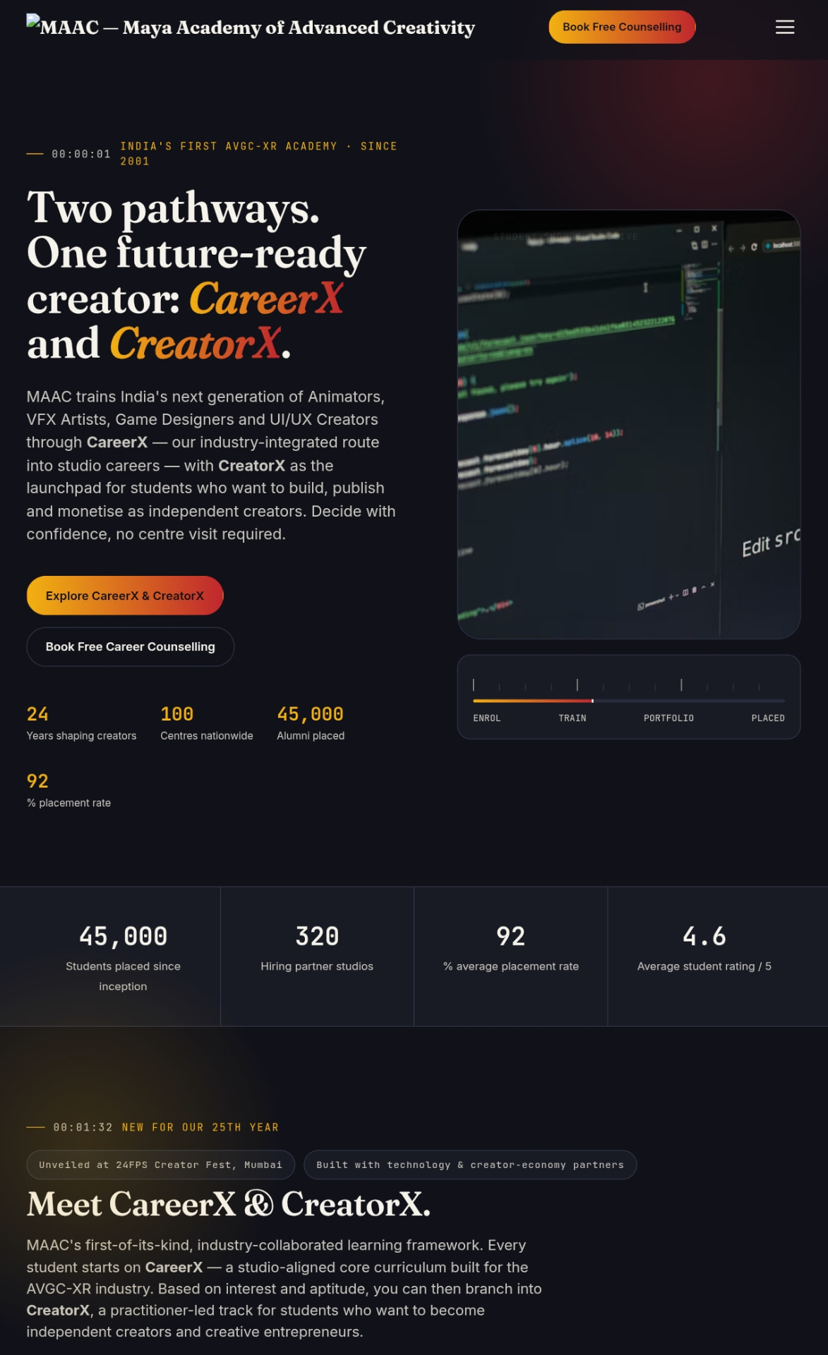
The redesigned MAAC site, running live
Scroll it, filter the course grid, toggle the EMI view and stack up to three courses in the compare tray — this is the working build, not a screenshot.
Context · an interface working against its own promise
"MAAC sells craft in interactive media, so its own website is the first portfolio piece a prospective student ever sees."
Because students who live inside intuitive, well-crafted software every day were being asked to trust a site that felt nothing like it.
Does the site help a curious student reach a decision, or does it only publish information about courses?
A student arrives ready to explore courses, fees and nearby centres, and instead has to fight the navigation just to find a starting point.
The brief I gave myself stopped being 'modernise the visuals' and became 'help someone decide'.
A written brief and success definition: the redesign wins if a first-time visitor can reach a confident shortlist without calling anyone.
MAAC trains India's next animators, VFX artists and game designers. The one interface meant to sell that promise was the weakest artefact in the funnel.
This is a self-initiated redesign for portfolio purposes and is not affiliated with or endorsed by MAAC.
A clear standard to design against — decision progress, not page views.
For a creative academy, the website is the demo reel. A confusing interface quietly contradicts everything the courses claim to teach.
The audit · finding where the signal breaks
"I walked the live site the way a prospective student would, holding one question the whole way through."
To locate the exact points where a motivated visitor loses the thread, instead of critiquing the design from the outside.
Can I answer 'which course is right for me, and where do I start?' using only what the site gives me?
Course categories were buried with no way to compare them, there was no path from 'interested' to 'enrolled', no way to find a nearby centre without hunting a static page, and no sense of momentum toward a decision.
Every failure was a decision failure, not a layout failure — which meant a nicer menu would have solved none of it.
A four-point audit that became the acceptance criteria for the redesign.

The audit walked the whole journey in one sitting: landing, course discovery, fees, centres and enquiry.
The pattern was consistent — the site was excellent at publishing and poor at guiding.
Four named breakpoints, each traceable to a specific screen in the final build.
Students weren't lost because they couldn't find pages. They were lost because no page moved them closer to choosing.
Reframing · from 'fix the menu' to 'build a system'
"A student's journey through the site mirrors the journey they are being sold: curious visitor, informed comparer, committed applicant."
To find a structure that carries a visitor through all three stages instead of dropping them at the end of each one.
What are the minimum systems needed to move someone from curiosity to commitment without a phone call?
Three connected systems cover the whole arc — Discovery, Decision support and Local commitment. Every audit failure mapped onto exactly one of them.
Navigation stopped being an information problem and became a decision-support problem.
A three-system architecture with each system owning one stage of the journey and handing off to the next.
Discovery gets a student to the right shortlist. Decision support helps them choose between shortlisted options. Local commitment turns the choice into an action they can take today.
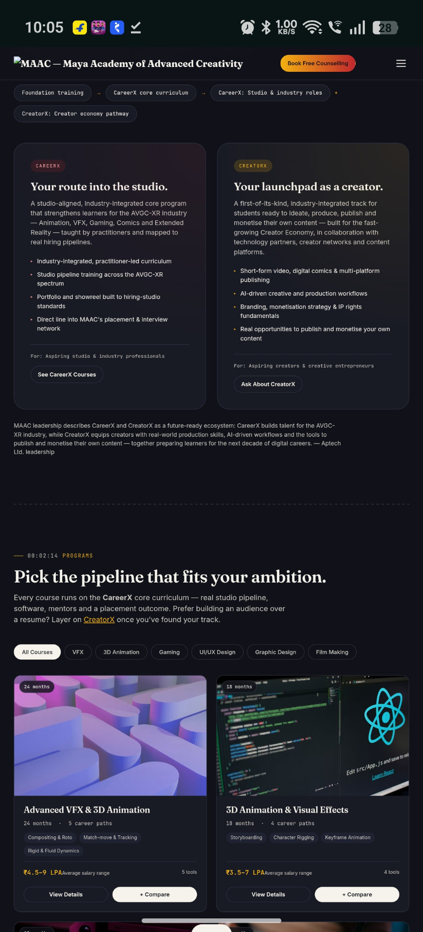
One structural idea that explains and justifies every feature that follows.
Navigation isn't a menu problem. It's the visible shape of the decision you're asking someone to make.
Course comparison, not just a list
"Choosing between VFX, Game Design and UI/UX is a multi-year bet — comparison is the core decision tool, not a nice-to-have."
Because a list forces students to hold three courses in working memory while scrolling between pages.
How many options does a student realistically weigh at once, and on which attributes?
Students compare on three things — curriculum, career outcomes and software — and rarely hold more than three courses in play.
The course grid became an input to a comparison surface rather than a destination in itself.
A persistent '+ Compare' tray holding up to three courses, plus a tabbed detail modal split into Curriculum, Outcomes and Software.
The compare tray follows the student across the course grid, so adding a candidate never costs a page load.
Each course card carries duration, career paths, key skills and the average salary range — the attributes that actually decide the shortlist.
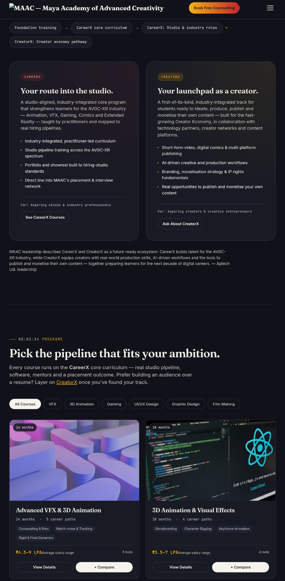
The multi-year decision happens on one screen instead of across five tabs and a notepad.
Capping the tray at three is the design. Unlimited comparison feels generous and produces paralysis.
Fees you can actually read
"Cost is the number one silent drop-off point, and silence is the worst possible way to handle it."
To stop price anxiety from ending journeys that would otherwise convert.
Is the barrier the fee itself, or the uncertainty about whether it can be paid in instalments?
Affordability, not absolute cost, is the real question — and the answer was buried in enquiry forms and phone calls.
Fees moved from something disclosed on request to something explored on the page.
An EMI toggle that switches every course's fee between full cost and 0%-interest monthly, in real time, with the scholarship path stated openly.
The toggle is global: flip it once and every fee on the page rewrites itself, so students never mentally convert numbers.
Cost anxiety becomes a simple choice a student can make privately before they ever contact a centre.
A toggle turns anxiety into arithmetic. Transparency is cheaper than the leads you lose to guesswork.
Find my centre, one tap
"The nearest centre is the point where online interest becomes an offline commitment — it deserves the shortest path on the site."
Because a four-click hunt through a static list sat directly on top of a real conversion path.
What does a student need to know before they will pick up the phone to a centre?
Distance is the deciding factor, and a static page cannot answer it — students were left estimating from a list of addresses.
Location stopped being reference content and became an interactive step in the journey.
A locate button that ranks centres by real distance and surfaces the nearest one, with the call button already knowing which centre to dial.
Every ranked result shows distance, address and a direct call action, so the last mile of the journey never leaves the page.
Finding your centre collapses from four clicks to one tap, protecting a conversion path that was quietly leaking.
The call button prefilling the nearest centre is the whole feature. Anything less leaves the student doing the system's job.
Visual direction · signal colours, not decoration
"Every accent is load-bearing: it confirms an action, tracks a choice, or shows progress — nothing is decoration without function."
To keep an information-dense site legible while it carries three interactive systems at once.
How much visual energy can a decision tool carry before it starts competing with the decision?
Colour used as feedback reads as confidence; colour used as garnish reads as noise on exactly the same page.
The palette was rewritten as a signal system with a rule for every accent before a single screen was styled.
Space Grotesk for display, Inter for body, JetBrains Mono for labels, and beacon-glow accents reserved for state, choice and progress.
Toast confirmations follow every key interaction, so the interface always tells the student what just happened.
A dense, high-energy interface that still reads calmly at the moment of decision.
If you can remove a colour without losing meaning, it was never doing work.
The redesigned site, live
"A navigation redesign can only be judged by using it — static frames hide exactly the behaviour this project was about."
To let a reviewer test the compare tray, EMI toggle and centre locator instead of taking my word for them.
Do the three systems hold together in one continuous scroll, or only in isolated screens?
The systems reinforce each other — comparison feeds fee exploration, which feeds the centre call. The journey only reads as one arc when it is running.
The deliverable stopped being a Figma file and became a working build.
A full working front end, built Figma → Lovable, embedded below and openable in its own tab.
The live build sits at the top of this page, framed in a browser window on desktop and one tap away on mobile.
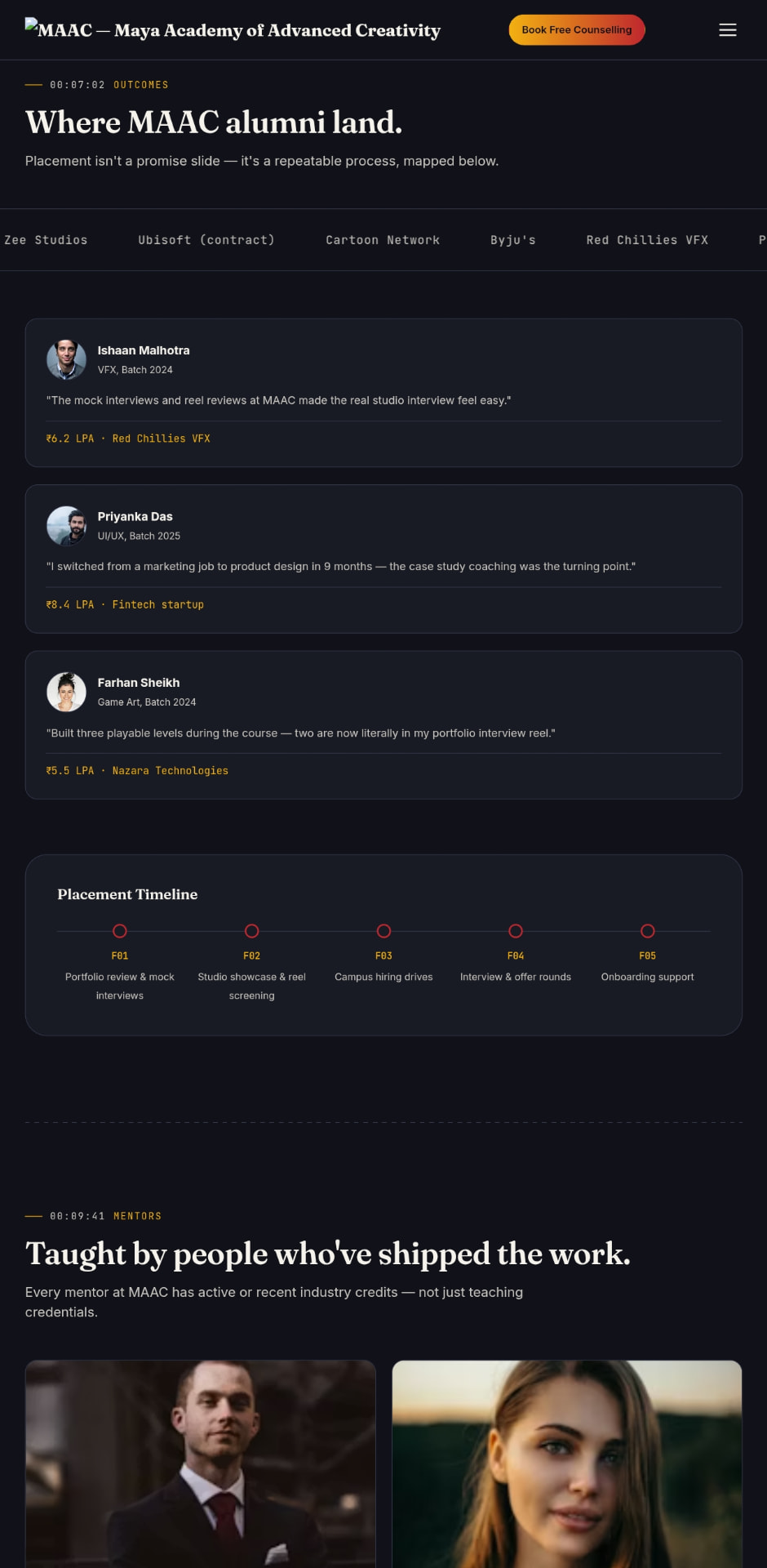
Recruiters can validate the claims in this case study in about ninety seconds of clicking.
Ship the prototype, not the picture of the prototype. Interaction design is only provable in motion.
Before and after · what changed
"The honest measure of a redesign is a line-by-line comparison with what it replaced."
To hold the final build accountable to the four failures the audit named.
Did every audit failure get a matching structural answer, or did some get styled around?
Each of the four breakpoints has a specific counterpart in the new build; none was solved with visuals alone.
The flat information site became a guided, self-serve decision journey.
A before-and-after mapping: static nav → persistent compare tray, hidden fees → real-time EMI toggle, no locator → one-tap ranked distance, no feedback → toast confirmations.
Static nav with no course comparison became a persistent tray holding up to three courses.
Fees that were hidden or hard to find became a real-time EMI toggle with a transparent scholarship path.
No centre locator became one-tap geolocation with a ranked distance list.
No feedback on actions became toast confirmations on every key interaction.
Every claim in this case study traces back to an audit finding and forward to a working feature.
Anyone can redesign a homepage. The value is showing that the same four problems you found are the four problems you solved.
Reflection
"The most useful thing I learned had nothing to do with layout."
To name the transferable lesson rather than closing on a screenshot.
What would I carry into the next navigation problem, at any scale?
Once I designed for the journey instead of the menu, every decision got easier and the number of screens went down.
I now start navigation work by mapping the decision, not the sitemap.
A repeatable approach: name the decision, name the stages, then build one system per stage.

Designing for the journey turned out to be the only honest way to signal progress toward a real decision.
A method I can apply to any product where users have to choose between committing options.
Navigation isn't a menu problem, it's a decision-support problem.
What changed
- ●Static nav with no comparison → a persistent compare tray holding up to three courses.
- ●Fees hidden or hard to find → a real-time EMI toggle with a transparent scholarship path.
- ●No centre locator → one-tap geolocation with a ranked distance list and a prefilled call action.
- ●No feedback on actions → toast confirmations on every key interaction.
- ●A flat information site → a guided, self-serve decision journey.
- ●Self-initiated redesign for portfolio purposes; not affiliated with or endorsed by MAAC.