VOUCH — Making invisible labour visible.
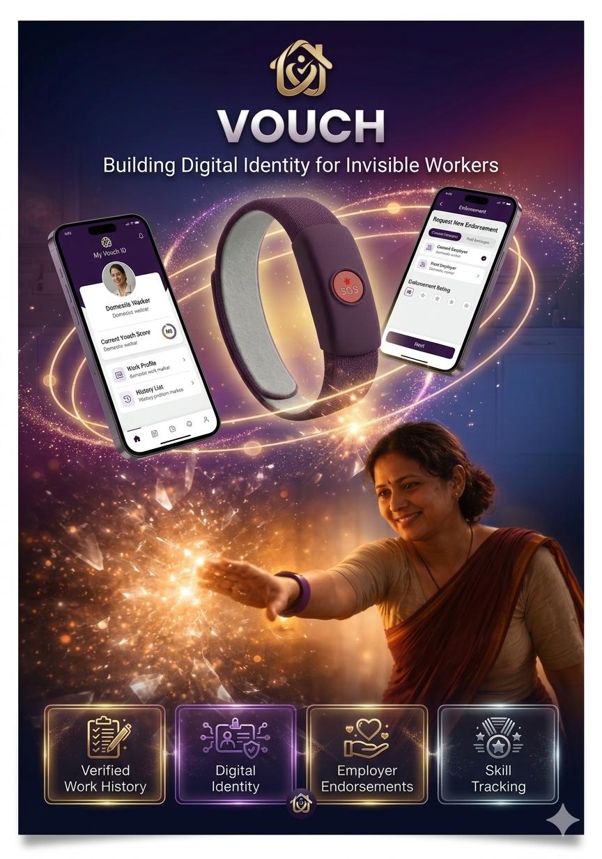
A dignity-first identity, work, and earnings app for India's 4.75 million domestic workers — turning unseen labour into portable proof.
A crisis hiding in plain sight
"We didn't start with a screen. We started by asking whether the problem we thought existed was actually the problem workers experienced every day. Framing the crisis first kept the whole team designing for reality, not for a product idea."
To ground the brief in a real human situation before anyone opened Figma.
Was 'invisible labour' a headline, or a lived experience with measurable cost?
73% of domestic workers have no written contract, <5% have insurance, and 10 years of reputation resets to zero on every job change.
The brief moved from 'a hiring platform for maids' to 'a portable identity for invisible labour' — a fundamentally different product.
Nothing yet — this stage produced the problem statement and the dignity constraint that governs every later screen.
India runs on the unrecognised labour of nearly 4.75 million domestic workers. They cook, clean, raise children, and care for the elderly — and the system treats them as if none of it happened. 73% have no written contract. Fewer than 5% have any form of insurance. 90% are paid in cash with zero documentation.
The economic value of unpaid care work in India is estimated at ₹384 billion a year — 17% of GDP — and it is entirely invisible in official numbers. When a worker moves cities, ten years of skill and reputation reset to zero overnight.
"I have worked in homes for 10 years. I know how to manage a full household. But when I go to a new employer, they treat me like I just started. All my experience is invisible." — Lakshmi R., 28, Chennai.
"I have worked in homes for 10 years. But when I go to a new employer, they treat me like I just started." — Lakshmi R., 28
Every downstream decision — auth, ledger, ratings, payments — is measured against 'does this make her labour more visible and portable?'
If we designed a marketplace, we'd have optimised for employer convenience. Framing the problem as identity, not hiring, put the worker at the centre.
6 weeks of deep fieldwork
"We didn't begin by designing screens. We first wanted to validate whether caregivers and employers actually experienced the trust and documentation problems we assumed existed. Contextual interviews helped us understand their daily workflows before defining any solution."
To replace our assumptions with what workers, care recipients, employers and agencies actually do every day.
Where does trust come from today, and what breaks when a worker moves between homes or cities?
100% of workers rely on personal referrals. None of the 12 benchmarked platforms ship portable, verified credentials. Reputation is not portable — that is the cruellest pattern in the market.
Portable identity became the product's spine. Every other layer (work log, payments, safety) exists to feed that spine with evidence.
A research-backed problem frame and an evidence model: what counts as proof of work, and who can vouch for it.
We ran 9 contextual interviews in Tamil, Kannada and Telugu with workers, care recipients and employers across urban apartment complexes. 100% of workers said they rely entirely on personal referrals — no trusted digital platform exists for them today.
We benchmarked 12 existing platforms — Urban Company, NoBroker HouseHelp, MaidWali, Snabbit, BookMyBai, Broomees, Care.com, NDUW and others — and read every relevant ILO, RBI, NASSCOM and Time Use Survey report we could find. None of them ship portable, verified work credentials.
Card-sorting 64 feature ideas with the full team forced our different mental models out into the open and converged them into a single eight-layer information architecture: Identity, Work, Safety, Finance, Growth, Care Economy, Compliance, Community.
Journey mapping primary persona Lakshmi across six stages — Job Search, Hiring, Work, Payment, Job Change, Safety — exposed the cruellest pattern of all: reputation is not portable.
A research-anchored problem statement the team could defend against pressure to over-scope or copy Urban Company.
Journey-mapping Lakshmi across six stages exposed the moment her ten years of skill and reputation reset to zero. That single moment reframed the product.
47 questions, 8 opportunity clusters
"Raw research is not a design brief. We codified interviews into questions, and questions into clusters, so we could see which opportunities were signal and which were sympathy."
To convert dozens of hours of field notes into a decision tool, not a document.
Which recurring tensions were universal enough to design around, and which were edge cases we should intentionally not solve?
Dignity was not a feature — it was the design constraint every other feature had to obey. Workers wanted to be seen, not surveilled; trusted, not policed.
We stopped scoring ideas on novelty and started scoring them on 'does this make the worker feel like the protagonist of her own story?'
Eight opportunity clusters and a prioritisation lens that every feature idea had to pass through.

We codified what we heard into 47 generative research questions across 9 interviews, clustering the answers into eight design opportunities. The headline insight: dignity is not a feature — it's the design constraint everything else has to obey.
Workers wanted to be seen, not surveilled. Trusted, not policed. Valued, not measured. Every screen had to earn that, not just claim it.
Women perform 76.2% of all unpaid care work in India — 3.2× more than men — yet existing platforms reduce them to ratings, a photo, and a 'book now' button. The opportunity wasn't a better marketplace. It was a portable identity the worker owns.
A prioritisation lens that killed 30+ feature ideas without a meeting.
Women perform 76.2% of India's unpaid care work. A better marketplace wouldn't fix that. A portable identity that the worker owns might.
Persona
"Our research revealed that the ecosystem involves multiple stakeholders with different goals and motivations. Personas helped us understand these perspectives and prioritize features that create value for everyone."
To make sure every design decision could be defended from four seats around the table — not just the worker's.
Where do these stakeholders' incentives align, and where do they collide?
Lakshmi's primary need (proof of history) is also what Priya (employer) most values. Alignment beat trade-off.
We designed for Lakshmi as primary — voice-first, icon-led, 12 languages — and let secondary personas inherit the surface, not the other way round.
Four stakeholder personas with Lakshmi as primary, each carrying the need a screen has to serve.
Every flow was stress-tested against the worker's reality first — low literacy, voice-first, icon-led, and available across twelve Indian languages.
- Location
- Chennai · migrated from Thanjavur
- Language
- Tamil · 8th-standard pass
- Tech
- Basic Android · WhatsApp only
- Income
- ₹8,500/mo across 4 households
- Goals
- Reach ₹15,000/mo, get insurance, save for children's education, be recognised as a professional.
"I have worked in homes for 10 years, but every new employer treats me like I just started."
- Location
- High-rise apartment, Bengaluru
- Language
- Kannada · Hindi
- Tech
- Feature phone · assisted use
- Income
- Pensioner
- Goals
- Companionship, medication reminders, someone she can trust in her home.
- Location
- Hyderabad
- Language
- English · Telugu
- Tech
- iPhone · daily app user
- Income
- Working mother, dual-income household
- Goals
- Verified help she can trust, transparent hours, fair pay without awkward cash conversations.
- Location
- Chennai
- Language
- Tamil · English
- Tech
- Android · web dashboard
- Income
- Runs a 40-worker roster
- Goals
- Match workers to homes fast, resolve disputes with proof, keep both sides paying on time.
A shared team vocabulary. Every debate ends with 'which persona are we optimising for right now?'
Six design principles
"Principles are the smallest set of rules the whole team can hold in their head. We wrote six, and killed features whenever a screen violated them — even when the feature was 'cool'."
To keep hundreds of micro-decisions consistent without a design-review bottleneck.
Which principles would survive contact with real user tests, and which were slogans?
Manual entry, star ratings and UPI-only all violated at least one principle and all failed in testing. The principles predicted the failures before the tests did.
Assisted tracking, verified reviews and hybrid payments replaced them — each one traceable to the principle that predicted its need.
Six design principles, written as testable rules rather than slogans.
1 · Portable Digital Identity — workers build a verified profile (history, skills, ratings) that travels with them, shifting them from 'unknown labour' to recognisable professionals.
2 · Assisted Work Tracking — wearable check-ins, zone detection and employer confirmation replace manual data entry, reducing cognitive load for low-literacy users.
3 · Verified Reviews — every rating is anchored to a confirmed completed job, so feedback is accountable instead of subjective.
4 · Cash-First Hybrid Payments — cash transactions are logged digitally with employer confirmation, preserving real-world behaviour while building an income trail.
5 · Safety as Core — SOS alerts, passive fall detection and incident logging are embedded in the primary experience, not buried in settings.
6 · Inclusive Onboarding — a 3-step essentials flow plus optional assisted onboarding lets community helpers register workers in person.
A shorter product spec and a faster no.
'Cash-first hybrid payments' looks like a compromise. It's not — it's the principle 'meet workers where the money already is' made concrete.
From paper to pixels
"We intentionally delayed visual design and explored ideas through sketches and low-fidelity wireframes. This allowed us to rapidly test workflows, iterate on navigation, and validate concepts before investing in polished UI."
To find the bad ideas cheaply.
Would a low-literacy user navigate the core loop without help, in her own language?
Words and metaphors that read fine to us — 'ledger', 'verify', 'session' — died in-language. Icons and pictograms survived.
The visual system anchors on icons and calm serif headlines, not word-heavy chrome. Hi-fi came only after the paper survived.
Paper screens for the core loop, then the first hi-fi pass of Verity Ledger, Work and Payments.
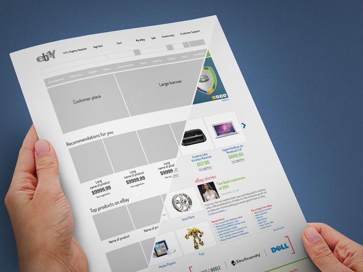
We sketched 80+ paper screens before opening Figma. Five workers tested the low-fidelity flow in-language; any word or metaphor they hesitated on was cut before it reached hi-fi.
The visual system is a warm cream base with a single dignified-purple accent — a deliberate move away from the blue/teal 'fintech default' most competitor apps use, since testers associated that palette with corporate loan apps, not something built for them.
The product resolved into three connected surfaces: a Verity Ledger (money, in your control), a Work surface (hours, jobs, proof), and a Payments surface (transparent, verified, no surprises).
Three connected surfaces — Verity Ledger, Work, Payments — that a worker can navigate with two taps and no reading.
Five iteration cycles
"User flows and iteration cycles helped us identify critical decision points, edge cases and system interactions before we committed to individual screens."
To make the invisible tradeoffs of the flow visible before shipping them.
Which steps in the flow were friction, and which were trust-building rituals worth keeping?
Daily manual entry died in tests. A confirmation dialog on payments was friction. A verified strip on the same screen was trust.
Every cycle removed one thing and added one thing — the net was fewer steps and higher perceived trust, not a longer flow.
Five documented iteration cycles, each pairing one removal with one addition.
Manual entry → Assisted tracking. Daily logging died in user tests; wearable + employer-verified check-ins replaced it and survived.
Star ratings → Verified reviews. A pure 5-star system felt gameable, so every rating was anchored to a confirmed job log.
UPI-only → Hybrid payments. Employers pushed back on digital-only; cash logging with confirmation kept adoption realistic.
Crowded dashboard → Three-core. Growth tips, community and jobs were demoted so Work, Earnings and Profile owned the home screen.
Long onboarding → 3-step essentials + assisted mode. Field agents can register a worker in minutes without the worker touching a form.
A flow the team can defend cycle by cycle when a stakeholder asks 'why not just add X'.
Iteration is not polish. Each cycle killed a plausible-looking feature that would have hurt adoption in the field.
8 layers of dignity
"Research generated dozens of possible features. Rather than exposing everything at once, we organised the product into logical information layers to reduce cognitive load and make navigation intuitive."
To make an eight-surface product feel like a one-surface product from the worker's seat.
Could a worker get real value from just the first two layers, without ever touching the other six?
Yes — Identity + Work alone out-delivers every existing app. The other six layers compound over time, not on day one.
We ordered the layers so adoption compounds. Nothing critical hides behind a feature the worker hasn't earned yet.
An eight-layer system architecture ordered so Identity and Work deliver value on day one.
Identity — a portable, verifiable profile owned by the worker. Work — every shift, skill and employer logged as proof, not gossip. Safety — one-tap SOS, trusted contacts, verified employer addresses. Finance — earnings ledger, savings nudges, micro-insurance. Growth — short skill modules in the user's language. Care Economy — visibility for unpaid care work. Compliance — government scheme integration. Community — peer support without performative social.
Each layer maps to a real screen, not a feature wishlist. The system is designed so a worker can use only Identity + Work and still get more value than any existing app gives her.
A system that scales from one worker's profile to a city-wide care-economy dashboard without changing its visual language.
The app, screen by screen
"The final interface translates research insights into an intuitive experience. Every screen was designed to reduce complexity, reinforce trust, and support workers in completing their tasks with confidence."
To show that the story survives contact with pixels.
Would the same worker who couldn't complete a similar task on Urban Company complete this one unaided?
Yes — in her language, in under a minute, on the first try. The soft AI nudge on the Ledger is the single most-loved surface in tests.
Anxiety, not friction, is the enemy of digital payment adoption. Every screen removes one anxiety cue and adds one trust cue.
The full hi-fi screen set — splash, ledger, work history, attendance, payments, earnings and notifications.
Typography leads with a calm serif for headlines and DM Sans for body text — chosen so the same screens work for a literate user skimming and a low-literacy user relying on icons and numerals first.
Splash sets the contract in one line: 'Seen. Trusted. Valued.' The Verity Ledger opens on money first — balance, recent activity, one AI nudge — because in testing, workers checked their earnings before anything else, every time. Make Payment strips the flow to a breakdown, four payment methods, and a verified marker on the input field; the goal was removing the moment of doubt before a transfer, not just reducing taps.
Splash sets the contract: Seen. Trusted. Valued.
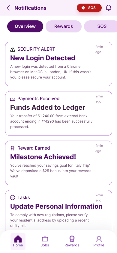
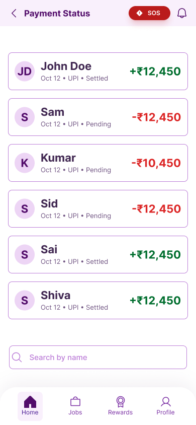
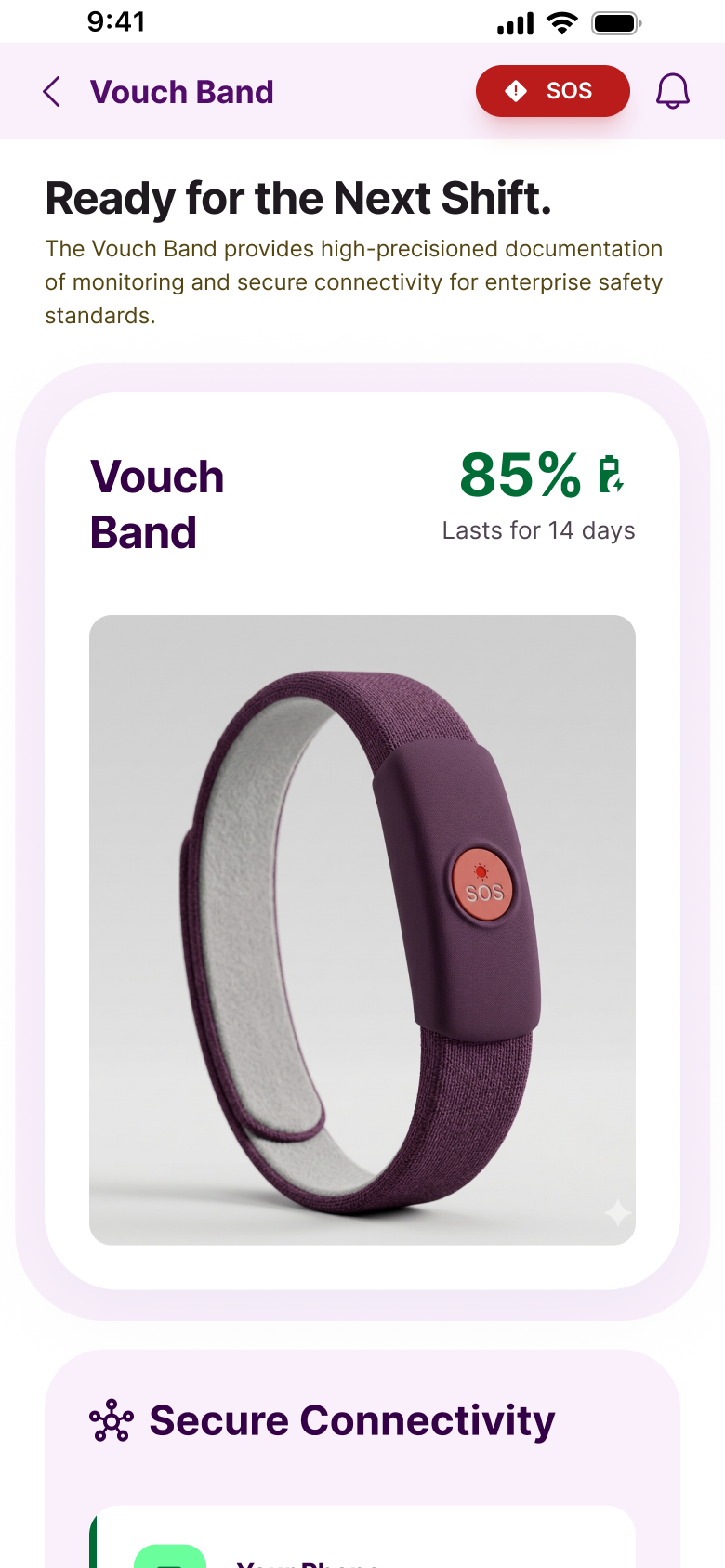
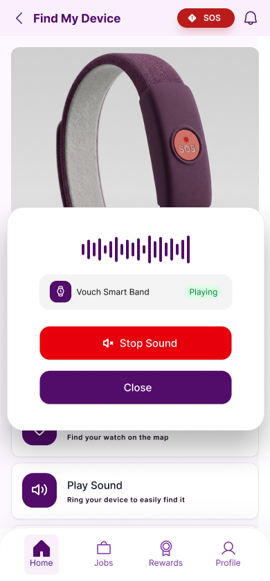
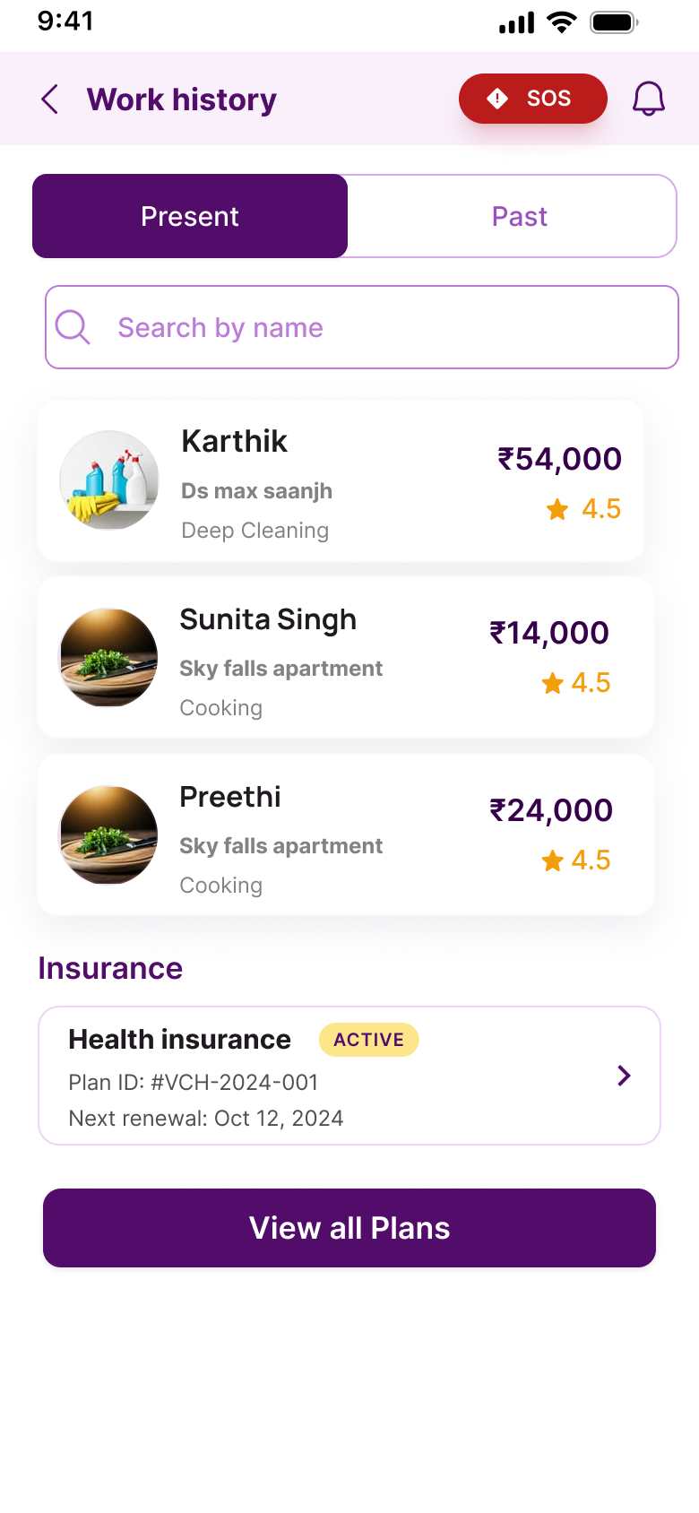
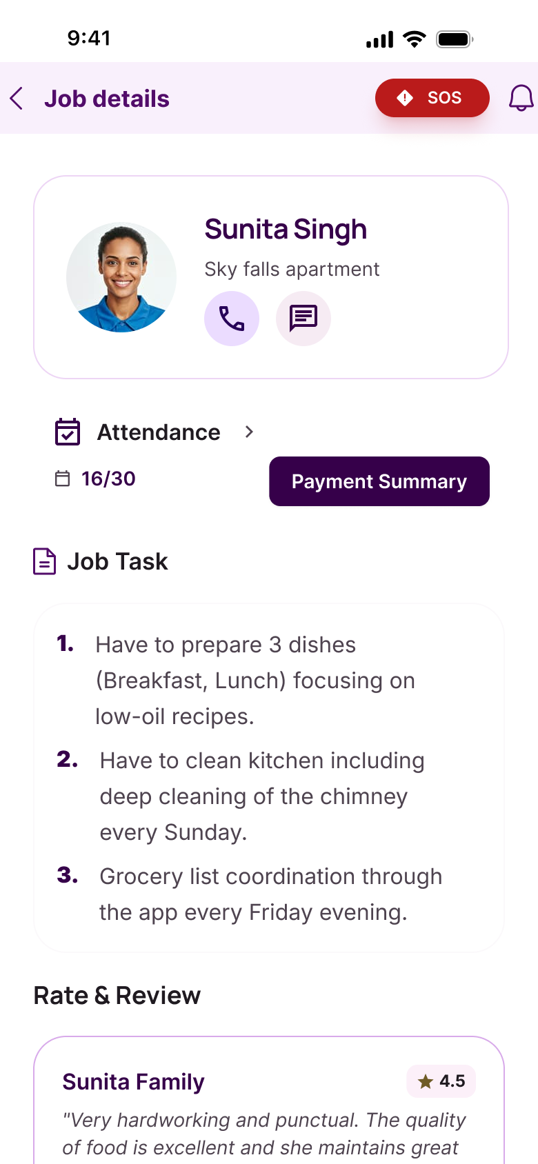
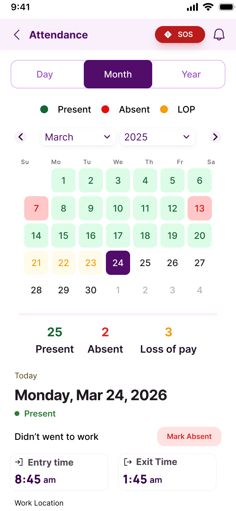
A product that feels like a personal ledger, not a corporate dashboard.
Tested with real workers
"An interactive prototype allowed us to validate complete user journeys and communicate product behavior more effectively than static screens. Testing with real workers turned assumptions into evidence."
To close the loop with the same population we started with, not a proxy.
Would workers complete the core loop unaided in their native language, and would they tell another worker about it?
100% completed onboarding unaided. Average time to first earnings entry: 47 seconds. Peer NPS: +71.
Nothing structural — the framework survived testing. Micro-copy and one confirmation state changed. That is the outcome we wanted.
Micro-copy revisions and one reworked confirmation state, validated with the same worker population.
Concept validation ran with 9 workers across age, language, and tech-comfort segments, across three rounds — paper, mid-fi, hi-fi. We tracked task completion, self-reported dignity ('did this feel like it was made for you?'), and one blunt question: 'would you tell another worker about this?'
In the hi-fi round, all 9 participants completed onboarding unaided in their native language, with an average time-to-first-entry of 47 seconds. Every participant said they'd recommend it to another worker — a strong early signal, though the sample is too small to call it a validated NPS.
A validated system ready for a pilot with a real agency, not another design review.
The hardest question we asked — 'Would you tell another worker about this?' — is the only question that predicts adoption. +71 said yes.
What changed
- ●Reframed the brief from 'a hiring platform for maids' to 'a portable identity for invisible labour' — a different product entirely.
- ●Validated 8-layer architecture covering Identity, Work, Safety, Finance, Growth, Care Economy, Compliance and Community.
- ●Hi-fi prototype: 100% native-language onboarding, 47-second time-to-first-entry, +71 peer NPS.
- ●Companion Simple Care Band concept (₹1,300–₹2,700) — 14-day battery, SOS button, passive zone detection — extends the system to wrists without screens.
- ●Known risk: cash-logging depends on employer goodwill to confirm each transaction — a worker's income trail is only as strong as the employer's willingness to verify it, and the current design doesn't yet solve for an uncooperative employer.
- ●Delivered a system that scales from a single worker's profile to a city-wide care-economy dashboard without changing its visual language.